Brit + Co
Rich illustrated guides for Brit + Co readers
At Brit + Co, I experimented creating beautiful, evergreen content optimized for search engines. Readers and brand collaborators expected a visually-rich experience from Brit + Co, but our frontend was not performant with a 67 on PageSpeed insights, affecting SEO ranking. We wanted to build performant storytelling experiences with our new guide initiative that still looked good.
For our new guides, I drew from foundational research I conducted with Brit + Co readers, prioritizing readers who did serious research to make their lives easier. How might we help our reader go deep on a beauty staple or fashion trend? I conducted a competitive analysis and contrasted results with experiences flagged by our sales team as stellar and sellable. I paired with an editorial lead to generate format ideas ranging from boomerang-like GIFs to atmospheric videos. I built a desktop and mobile prototype of the denim guide in Codepen so our photo contributors and editorial staff could visualize and ideate with design and eng in real time.
The Denim Guide launched and hit our key goals: our new frontend jumped from 60 to 87 on Google's PageSpeed Insights tool, readers loved it, and traffic grew over time. We did further iteration based on user feedback, focusing on easy navigation for long guides; the table of contents and a new recipe module were incorporated into a holiday cookie guide.
Building visual tools for editors
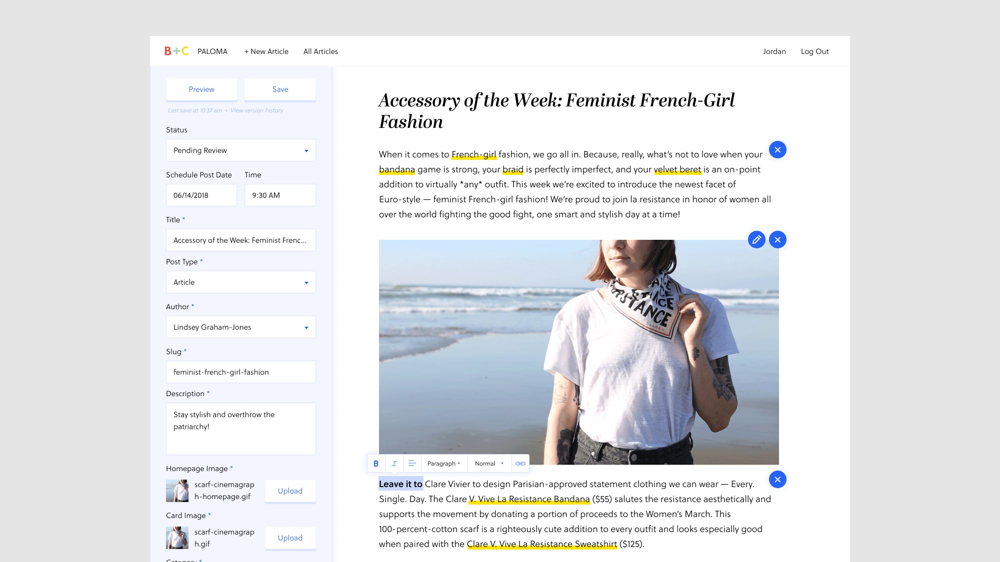
Editors couldn't produce high-quality multimedia articles with Wordpress. And guides were bespoke, requiring a significant amount of design, engineering, and product effort. Editors were unable to tell great stories on their own at scale, so I designed the MVP and long-term vision for a new editing tool and CMS.
How might we design an easy-to-use tool that allowed editors, designers, photographers, and videographers to collaborate and build beautiful, high quality articles together? Our MVP was barebones, supporting the following:
- Create, edit, and view a guide.
- Save and publish a guide.
- Write and format text.
- Upload or link to images and videos.
- Control the size and position of videos and images.
- Divide the guide into chapters to which an editor can directly link.
- Edit metadata like tags, categories, URL slugs.
We conducted usability testing with editors as each feature came online. We quickly added collaboration features like locking, after one editor accidentally paragraphs written by another. We also added features to support just-in-time news editors, including richer sorting features, clearer draft and scheduled statuses, and commenting and feedback features.
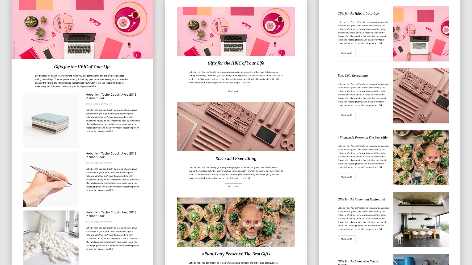
We published our Holiday Cookie Guide, a rich multimedia experience built with our new editor tool. Editors produced these beautiful articles at a greater pace, going from one every six months to a one guide per month in 2018
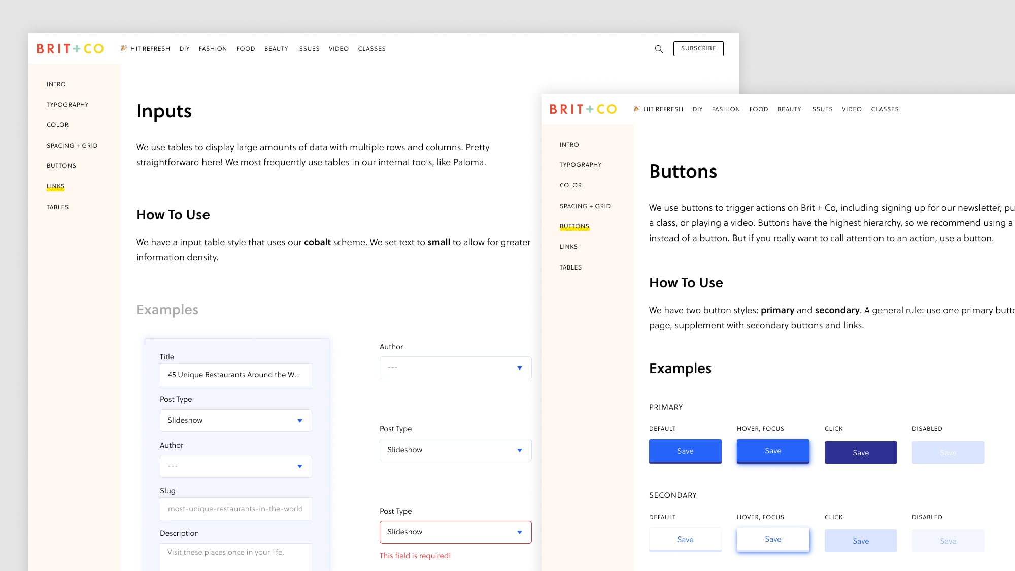
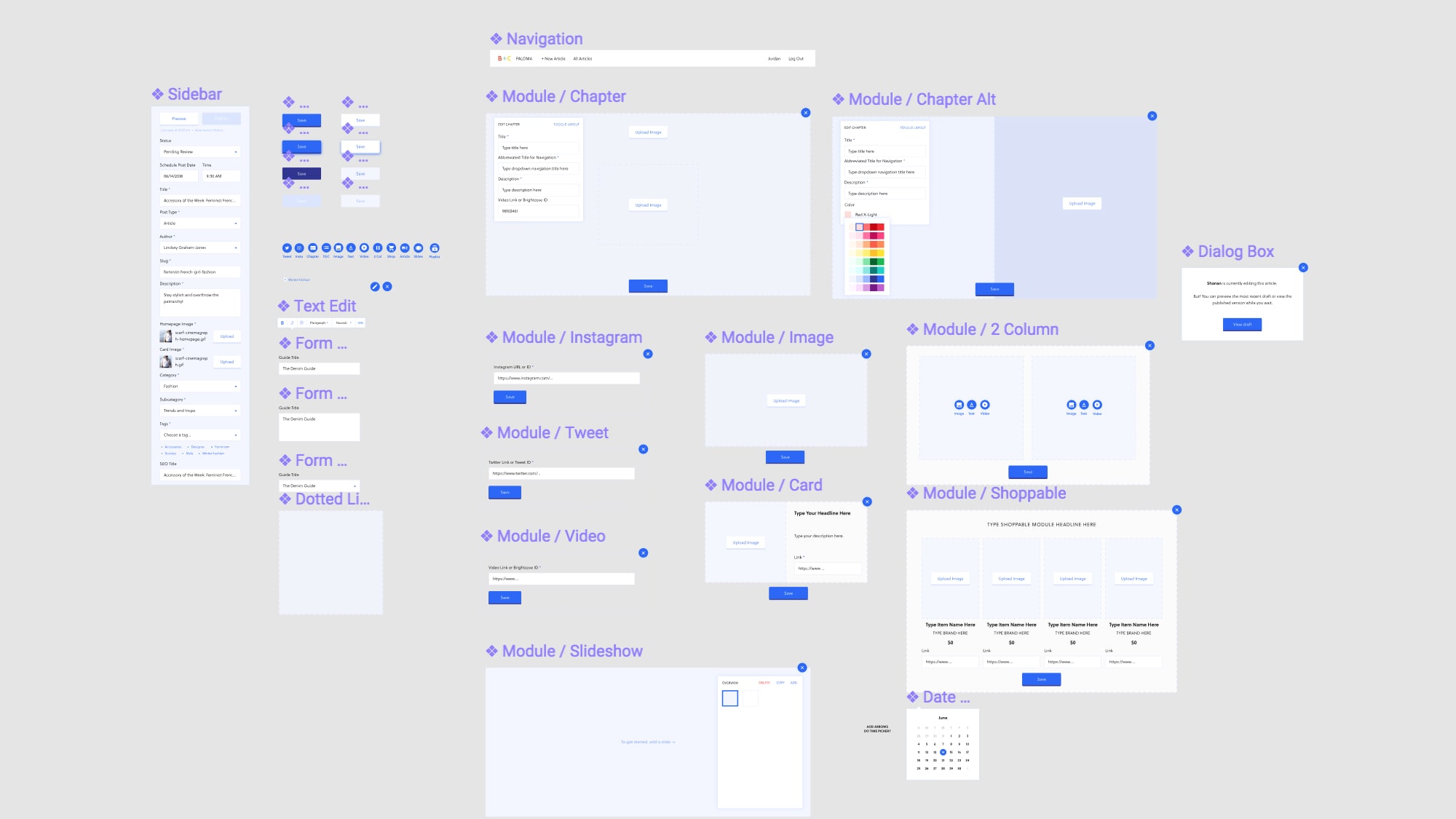
As we built the MVP, I standardized the design system and established a style guide. I outlined the information architecture and identified existing and needed components.
One key component was helping new editors learn a new tool and feel comfortable in a new workflow. To increase tool adoption, I did the following:
- Hosted learning sessions with branded content contributors, editors, editorial contributors, and designers to introduce them to a new tool and gather their feedback and pain points in real time.
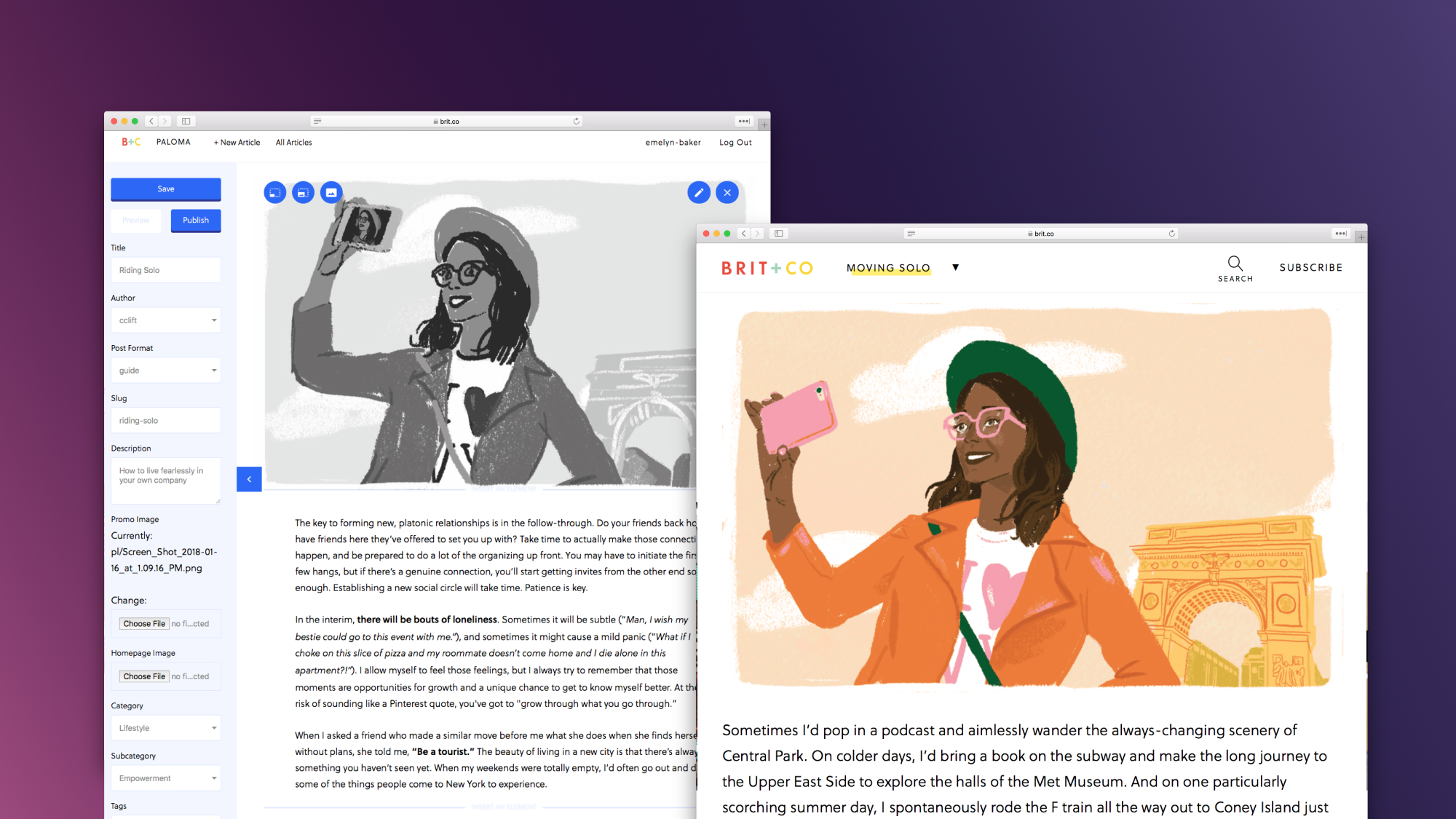
- Participated in weekly cross-department meetings for editorial initiatives. The initiative Riding Solo was an excellent forum for me to hear from editors, designers, and other creatives as they used the new tool to gather ideas and improvements.
- Helped get editors and other contributors unstuck. Acting as a debugger helped me hear raw, honest feedback and build trust among stakeholders.
This helped us improve the tool, onboard users, and reprioritize features. And reviews have been positive, including this quote from a stakeholder: I love it. I am obsessed with this tool.
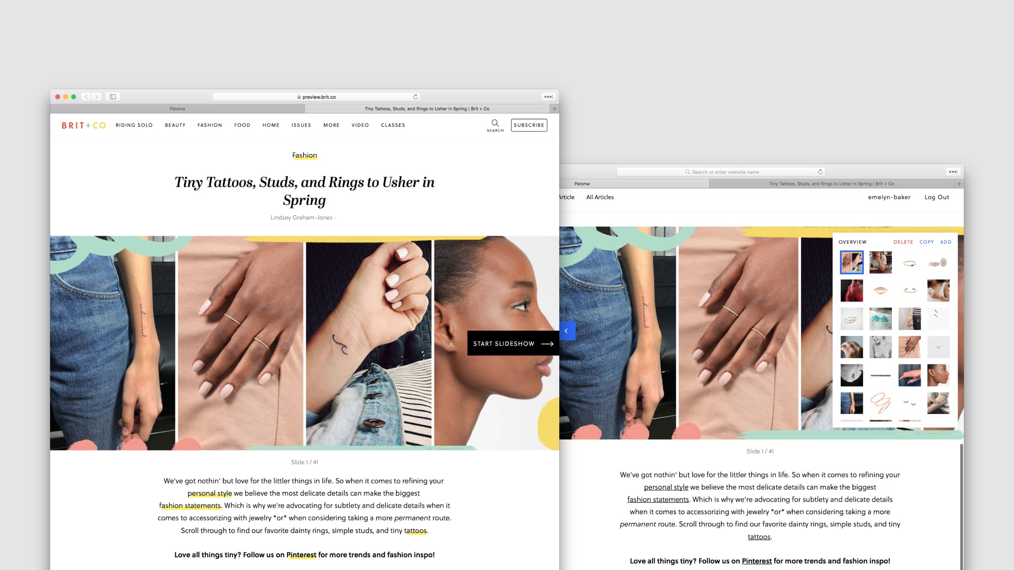
Building slideshows for readers and editors
In 2017, Brit + Co launched slideshows to increased engagement and reader satisfaction. We built the slideshow tool on top of Wordpress, however, editors found creating slideshows painful. Our editor Lesley put it keenly: 'I would rather spend 30 minutes writing a basic article than spend 2 hours editing a slideshow.' Ouch. We thought we could do better, so I conducted research with Lesley and 4 other editors on their process process. Key themes:
- Editors worked visually first. They started with a theme for each slideshow, but whether an item was kept or rejected was based on visuals.
- Style, beauty, and affiliate editors found high-quality photos to be time consuming and frustrating.
- Editors copy and pasted formatted text from Google Docs into Wordpress with unexpected results. Sometimes formatting would be preserved and everything would look fine. Sometimes it would not, creating errors in the live slideshow.
- If a contributor wanted to format text descriptions, she would have to write in hardcoded HTML. This slowed contributors down and created errors, and it was frustrating for editors to review the content.
- Ordering, reordering, and updating slideshows was time consuming, particularly if slides were hardcoded with a numerical list. Editors came up with numerous hacks to avoid it.
- Jumping between editing and previewing a slideshow was time-consuming.
We explored two options with stakeholders. Option A was a modern, contemporary UX - one stakeholder described this as the "Instagram stories" - but it required a keen visual eye, excellent layout skills, and more time to edit. Option B used the current slideshow frontend, focused on optimizing current workflows to make the transition seamless - but slideshows would feel more conventional . Stakeholders loved the unique qualities of Option A, but agreed that option B would help with speed, the primary need.
We finalized the following features with stakeholders for the MVP: batch upload photos, easily reordering and updating slides, WYSIWYG and keyboard text formatting, copy/paste stripping formatting, and viewing the slideshow in the CMS. Later, we added keyboard shortcuts and affiliate link converters.
We launched the editor and feedback was positive, resulting in a decrease in creation time and increase in slideshows created.